
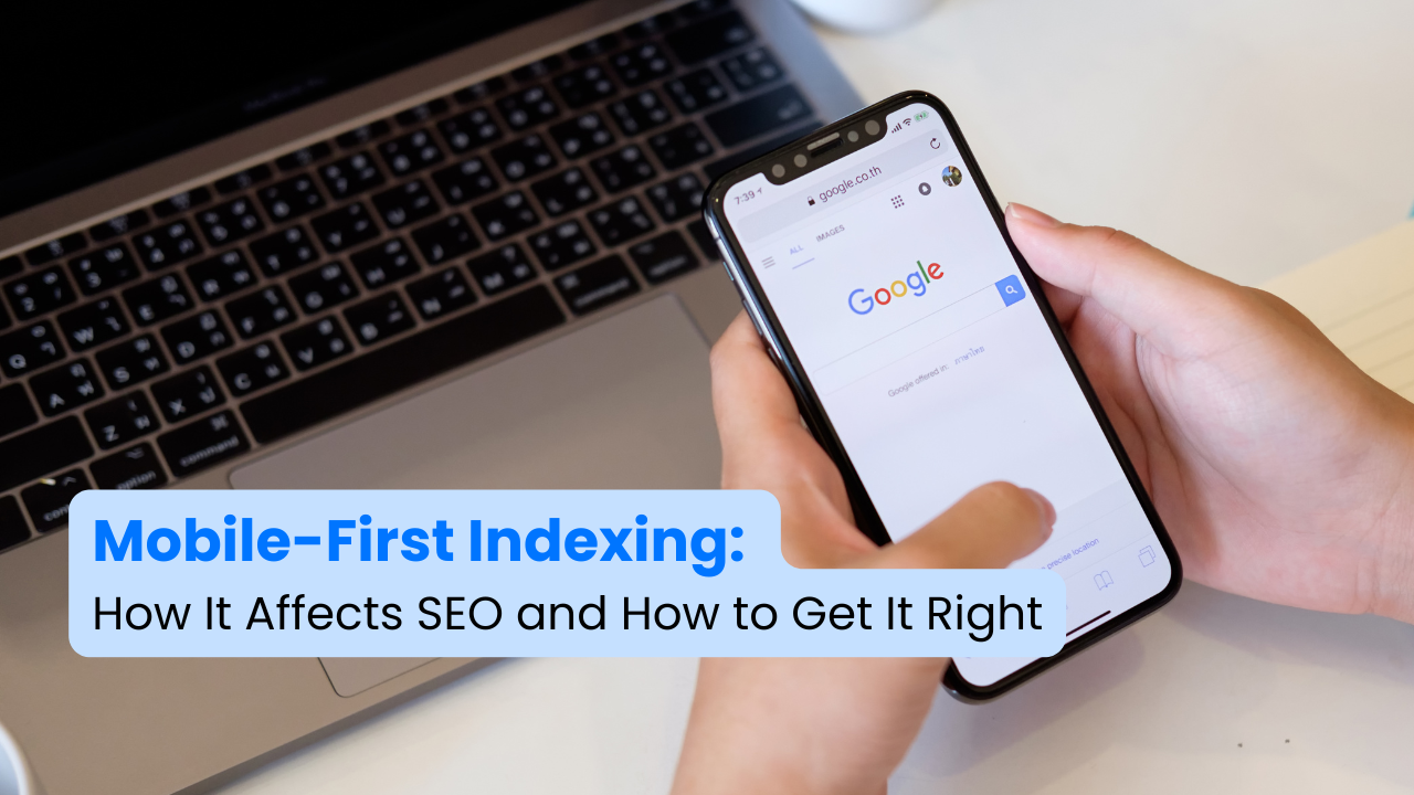
Google now focuses on the mobile version of websites when ranking them in search results. This means if your site is not optimized for mobile devices, it may not rank well, leading to lower traffic. Since most users browse the internet on their phones, Google wants websites to provide the best possible experience for mobile users.
Why Mobile-First Indexing is Important
- Google ranks websites based on their mobile version first.
- More than half of all internet traffic comes from mobile devices.
- A website that works well on mobile keeps visitors engaged and improves conversions.
If your site is not mobile-friendly, it may lose rankings and traffic over time. Optimizing for mobile is now a necessity.
1. Make Your Website Mobile-Friendly
A mobile-friendly website adjusts to different screen sizes and ensures a smooth user experience. Google recommends using responsive design, which automatically adapts a website’s layout to fit any screen size.
How to Make Your Site Mobile-Friendly
- Use Responsive Design: Your site should look good and function well on all devices.
- Avoid Pop-ups That Cover Content: Large pop-ups can frustrate mobile users and affect rankings.
- Ensure Text is Readable and Buttons are Easy to Click: Font sizes should be clear, and buttons should be large enough to tap easily.
- Keep Content the Same on Mobile and Desktop: Ensure both versions provide the same information and functionality.
Google’s Mobile-Friendly Test tool can help you check if your site is optimized for mobile devices.
2. Improve Page Speed and Performance
Website speed affects rankings and user experience. A slow website leads to higher bounce rates, meaning visitors leave quickly without engaging.
How to Improve Page Speed
- Compress Images: Use optimized formats like WebP to reduce file sizes without affecting quality.
- Reduce Unnecessary Code: Minimize JavaScript and CSS files to speed up loading times.
- Enable Caching: Store frequently used files to make repeat visits faster.
- Use a Content Delivery Network (CDN): CDNs store website data on multiple servers worldwide, improving speed for users in different locations.
- Upgrade Your Hosting Service: A reliable hosting provider improves loading times and website stability.
Use Google PageSpeed Insights to identify speed issues and optimize your site.
3. Make Content Easy to Read on Mobile
Visitors should be able to read and navigate your site without zooming or excessive scrolling.
How to Optimize Content for Mobile
- Use Short Paragraphs: Break content into small sections to improve readability.
- Use Bullet Points: Lists make information easier to scan.
- Avoid Large Blocks of Text: Format content so it’s easy to digest on smaller screens.
- Optimize Images and Videos: Ensure media files load quickly and display properly.
- Use Clear Headings: Guide users through your content with well-structured headings.
If your content is difficult to read or interact with on mobile, visitors may leave, which can negatively impact rankings.
4. Optimize Metadata and Structured Data
Metadata helps search engines understand your content, while structured data enhances how your site appears in search results.
How to Improve Metadata and Structured Data
- Use Schema Markup: Add structured data such as FAQ, Breadcrumb, and Product Schema to help Google display rich search results.
- Optimize Titles and Descriptions: Keep them concise, relevant, and engaging for mobile users.
- Use Alt Text for Images: Describe images clearly so search engines and visually impaired users can understand them.
- Ensure Content is Fully Visible: Do not hide important content behind buttons or tabs on mobile.
Using structured data correctly can improve your search visibility and user engagement.
5. Make Sure Google Can Access Your Mobile Site
If Google cannot properly crawl and index your site, it may not appear in search results.
How to Ensure Google Can Crawl Your Site
- Do Not Block CSS, JavaScript, or Images: Google needs access to these elements to understand your site.
- Use the Same Meta Tags on Mobile and Desktop: Ensure both versions have the same indexing settings.
- Avoid Lazy-Loading Important Content: Google must be able to see all key content without requiring user interaction.
- Check URL Structures: If using separate mobile and desktop URLs, use correct canonical and hreflang tags.
Regularly check Google Search Console for errors that might affect your site’s indexing and fix them immediately.
Conclusion
Google’s mobile-first indexing means mobile performance is now a key ranking factor. If your website is not mobile-friendly, it will struggle to rank in search results. Ensuring fast loading times, responsive design, and an easy-to-read content layout can help you stay competitive in search rankings.
Steps to Improve Mobile Optimization
- Use Google’s Mobile-Friendly Test to find areas that need improvement.
- Speed up your site by compressing images and minimizing code.
- Make your content easy to read and interact with on mobile devices.
- Implement structured data to enhance search visibility.
- Regularly monitor Google Search Console for mobile indexing issues.
Optimizing for mobile-first indexing is no longer optional. It is essential for maintaining search rankings, improving user experience, and attracting more visitors. Taking these steps now will help your website stay ahead in search results and continue growing.